A clearer first step
in the search for a home.
Designing the homepage, login overlay, and listing page within a collaborative property-search concept.
- Role
- UX / UI designer
- My scope
- Homepage, login overlay, listing page
- Team
- Three designers
- Format
- Web prototype · Figma
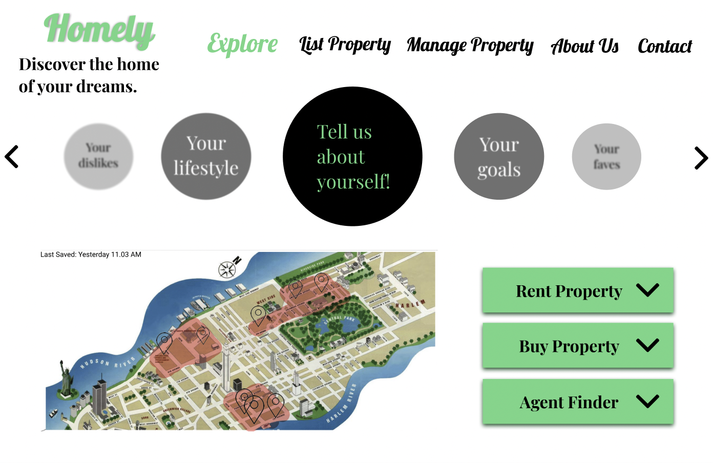
Earlier team exploration screen from the Homely style-guide artifact, not the final homepage. My specific design scope is detailed below.
A home search has more than one starting point.
Homely is a team-designed prototype for finding properties, listing a home, and connecting with agents. The concept brings these tasks into one experience, with preference-based discovery as part of the wider product.
In our three-person team, I designed the homepage, login overlay, and listing page. Those surfaces help people understand the product, access an account, and begin listing a property.
Homepage design · Login overlay · Listing page · Participation in UX research and testing
The survey, map, and other product features are shown as team context, not as work I designed alone.
People looked for an explanation where they already were.
My research process included interviews, guided cognitive walkthroughs, unassisted walkthroughs, and comparing design alternatives. The team’s guided-walkthrough materials outlined tasks across discovery, property listing, account access, and contact.
One important observation concerned the homepage. The team expected visitors to use About Us to understand the service. Evaluation feedback showed that this was not a natural first step.
“I usually don’t read About Us.”Evaluator feedback recorded in the Homely demo presentation
That raised a more useful design question: what does someone need to understand on the homepage before choosing their next action?
Bring essential context onto the main path.
Important information was easy to miss.
Visitors did not naturally navigate to About Us for an explanation.
Move the explanation to the homepage.
The demo documents moving useful introductory content onto the page people were already exploring.
Make repeated controls feel related.
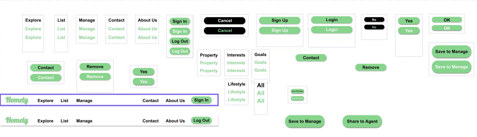
The team also documented inconsistent buttons and developed shared button styles.
The team’s evaluation gave context for the surfaces I designed. The homepage needed to explain the service; the login overlay needed clear actions; and listing needed a recognizable starting point within the same interface.
An evaluated prototype, with a clear next iteration.
Homely shows how an observed expectation can lead to a concrete interface change. The project materials document evaluation feedback and the team’s design responses; they do not establish a production launch or measured performance gain.
A next iteration would check whether a new visitor can explain the service from the homepage, enter and leave the login overlay confidently, and find the property-listing starting point without assistance.
View the homepage in FigmaFigma access may be required.